top of page

Search


Data Visualization
The data visualization plot presents a comprehensive image of the data that allows you to look at the entire data at once, which is...


Investigating Features Interaction with ALE
Investigating the nature of interaction between two features and its effect on a model’s prediction might provide insightful knowledge...


Working Point
Working point is an easy knob to use in order to optimize the model performance to fit our needs. Working point (WP) is a value between 0...


Categorical Features Table
The categorical features table summarizes multiple statistics about every categorical feature in the data, allowing it to be investigated...


Feature Interaction
Features often interact with each other under model predictions, and therefore interaction analysis can provide meaningful insights for...


Numerical Features Table
The numerical features table summarizes multiple statistics about every numerical feature in the data, allowing it to be investigated all...


Features Shared Distribution
Shared distribution heatmap is a very useful and visual way to examine the spread and legitimacy of the data and understand how different...


Feature Histogram
Feature histogram enables a single glance to view each features general distribution split between the labels categories. For continuous...


Feature Leakage
The feature leakage ROC plot is a graphic way to evaluate the potential leakage there might be between each feature and the label. Data...


Labels Distribution
The label distribution pie chart gives us a quick way to understand the balance of labels in the data, identifying potential unbalancness...


Precision-Recall Curve
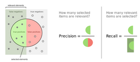
Precision-Recall Curve is a graphic way to evaluate the model performance and trade-offs under different working points. Precision is a...


Confusion Matrix
Confusion Matrix is a table that describes the performance of a classification model on a set of test data for which the true values are...


Counterfactual Analysis
Counterfactuals provide an easy to understand local explanation to models prediction using a counter example providing a what-if...


Anchor Analysis
Anchors provide an intuitive set of rules that emphasis the features that are locally sufficient for the model to make a decision. These...


Dependence Plot Per Feature
The partial dependence plot (PDP) shows the marginal effect one or two features have on the predicted outcome of a machine learning...


Prediction Histogram
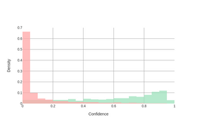
A prediction histogram is an intuitive graphic way for visualizing model predictions and the separation it achieves for the actual...


Force Plot
Force plots are a very intuitive and visual way to understand the influence of each feature on the models prediction for a specific...


Calibration Plot
Calibration plots give us a snapshot to understand how well a model's prediction correlate with a measure of probability that it is...


Receiver Operating Characteristic (ROC) Curve
Receiver Operating Characteristic Curve is a graphic way to evaluate the model performance and the trade-offs under different working...


Feature Importance
Feature Importance plots are a great way to get a sense quickly how much a model is relying on each feature to make it predictions....
bottom of page